Colony Graphs: Visualizing the Cloud
What does the cloud look like? As a customer, you may have thousands of instances running a variety of applications. As a cloud provider, you may have thousands of customers, running everything imaginable.
A process colony graph, or "ptree graph", is a way to visualize your live application environment, based on basic process details. It illustrates the number, types, and activity of your applications, and allow you to spot unusual or problem areas.
The following sections show ptree graphs at increasing scales, from a few processes to an entire cloud datacenter.
1. Processes
Examining just a few processes to begin with (click any of these images for the full version):
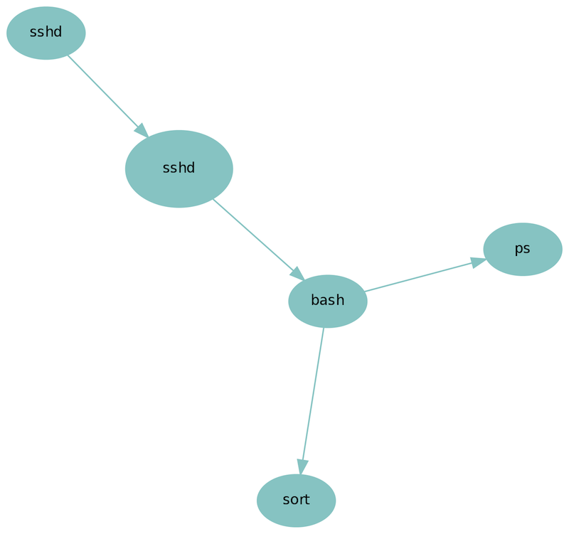
Parent-child relationships are shown with arrows. The size of each process reflects recent CPU usage: bigger means busier. The color identifies the type of process: system processes are shown in light blue. These details can be adjusted - the process size could show memory footprint, for example.
2. Zone
This is what a typical cloud computing node looks like (also known as a "zone" or "container"), in this case, a web server:
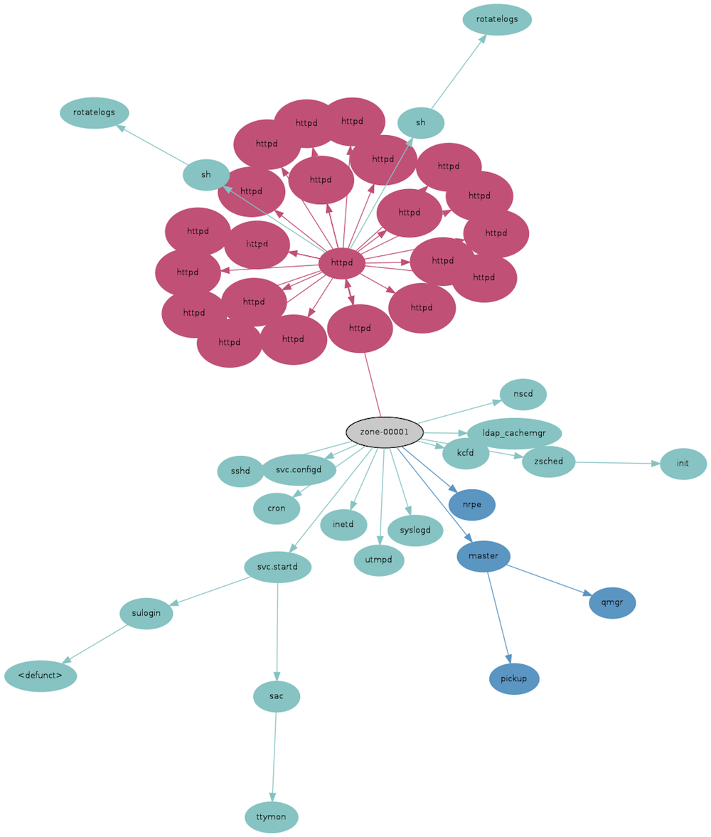
The master process for the web server can be seen surrounded by its worker processes, all shown in red. The worker processes are drawn larger, since they are busier on CPU doing work to respond to web requests. In the middle is a gray oval representing the "init" process of the zone (the real customer zone name has been scrubbed here). The full set of system processes that make up the zone can also be seen, with their relationship.
3. Server
Now scaling to show an entire physical server, which is running nine zones (plus one "global" zone):
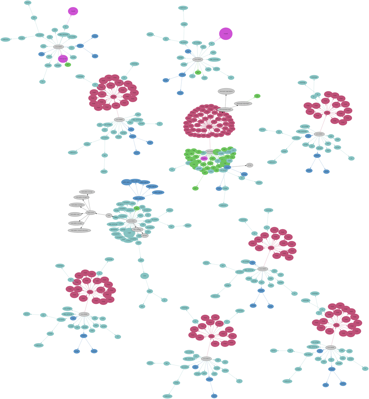
Green is for language related processes, such as php, python, java, etc. Pink shows database processes, including MySQL, memcached, Riak, etc. The green/red zone is a Ruby/Apache server, and the top left zone has both mysqld and memcached. The largest pink process at the top is a busy MySQL server.
Previously I could look at lists of processes using ps or ptree to see the same data. But getting a quick sense of what's processes exist, and are busy, from pages of text output becomes unwieldy. Consider examining the same data on a rack of servers – in can become hundreds of pages of text.
4. Rack
Visualizing all the zones in a rack:
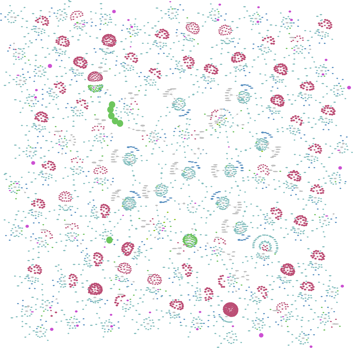
More zone types pop out and can be identified quickly. The chain of five green circles is a Perl server, with five busy perl processes. At this scale, this visualization is starting to look like a bacteria colony in a petri dish (which was inspiration for the name: colony graphs).
5. Datacenter
Now for a datacenter, which consists of a fleet of racks. These constitute an "availability zone":
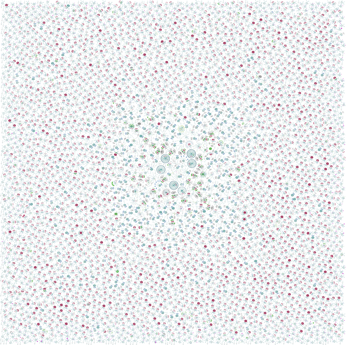
It's the first time I've seen all the processes in an entire datacenter in one image. This includes over 300 servers and over 3500 zones. Gathering the process data to generate this was easier than it sounds: since this is an OS virtualized cloud, I only needed to login to the 300 physical servers, and not the 3500 individual zone instances, to capture all processes running.
This image can be generated automatically to look for anomalies and changes in the cloud. I've made many discoveries so far, with the graphs often beautiful and unexpected.
Dead Zone
One of the discoveries can be seen in the middle of the graph above: six large zones that appear as concentric circles. Here's how they look zoomed in:
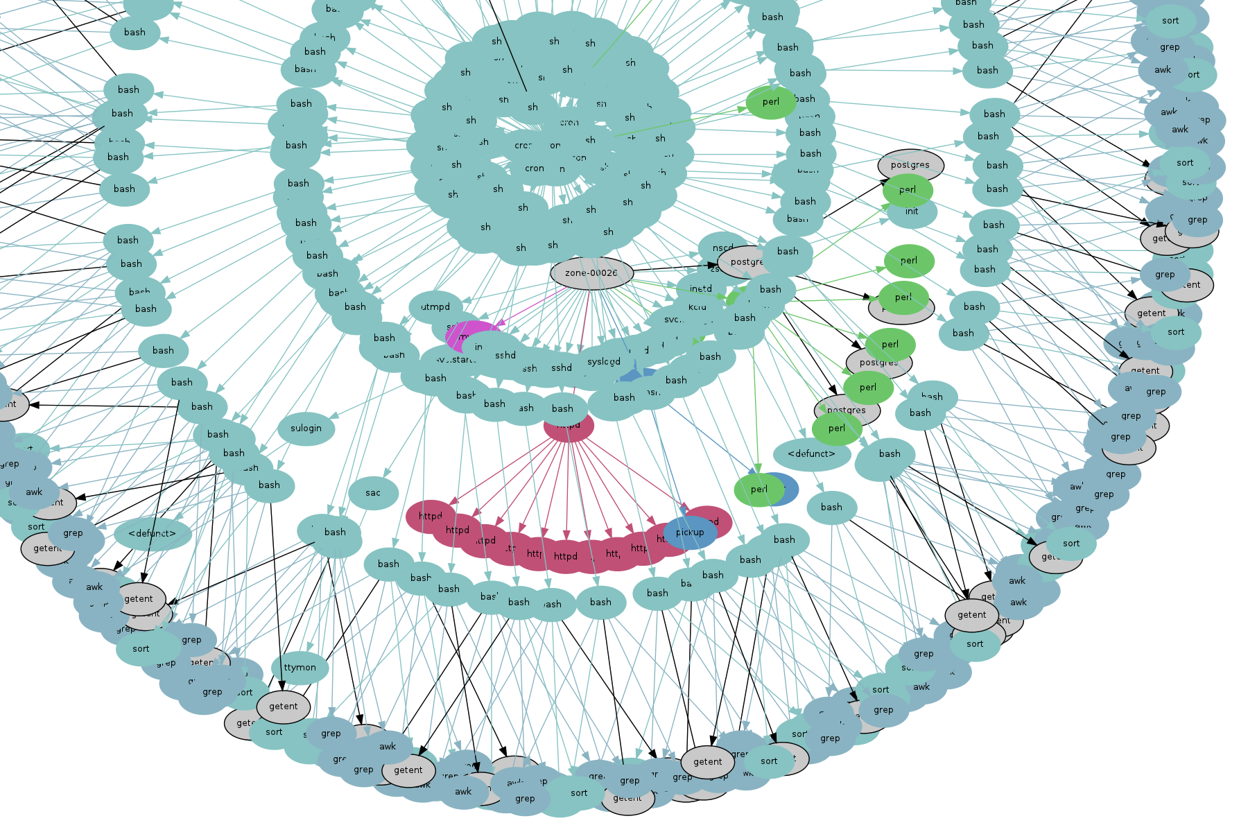
My jaw dropped when I first saw this. What's happened is that this zone is running a shell program via cron (system scheduler), that processes the result of getent. The getent process is stuck on an LDAP lookup that never completes, and so all its related processes are also stuck. Cron kept generating these mindlessly, until the zone had hit its process limit.
Fortunately these were old test zones that were not hurting anyone.
Implementation
These ptree graphs are based on process ID, parent process ID, process name, recent percent CPU, collected using just ps(1):
# ps -eo zone,ppid,pid,rss,pcpu,comm
This includes a couple of extra fields: zone name (zone), for mapping any later discovered anomalies back to the origin zone, and resident set size (rss), for generating ptree graphs based on memory usage instead of CPU usage, when desired.
I've been using the neato program from graphviz to generate the images from this data. It reads a graph description in DOT format, and I wrote a trivial shell/awk program to convert the ps(1) output into DOT: ps2gv-p.sh, which has the companion file colors.awk.
Here's an example of their use, to examine processes on my macbook, which has graphviz already installed:
$ ps -eo ppid,pid,rss,pcpu,comm | awk '{ print "-", $0 }' > ps-macbook.txt
$ ./ps2gv-p.sh ps-macbook.txt
$ neato -Tpng -Nfontsize=12 -Elen=1.9 ps-macbook.gv -o ps-macbook.png
The ps(1) on OS X doesn't have the zone field, so I used awk to add a dummy field. If you are elsewhere, use the earlier ps(1) command.
The resulting image is:
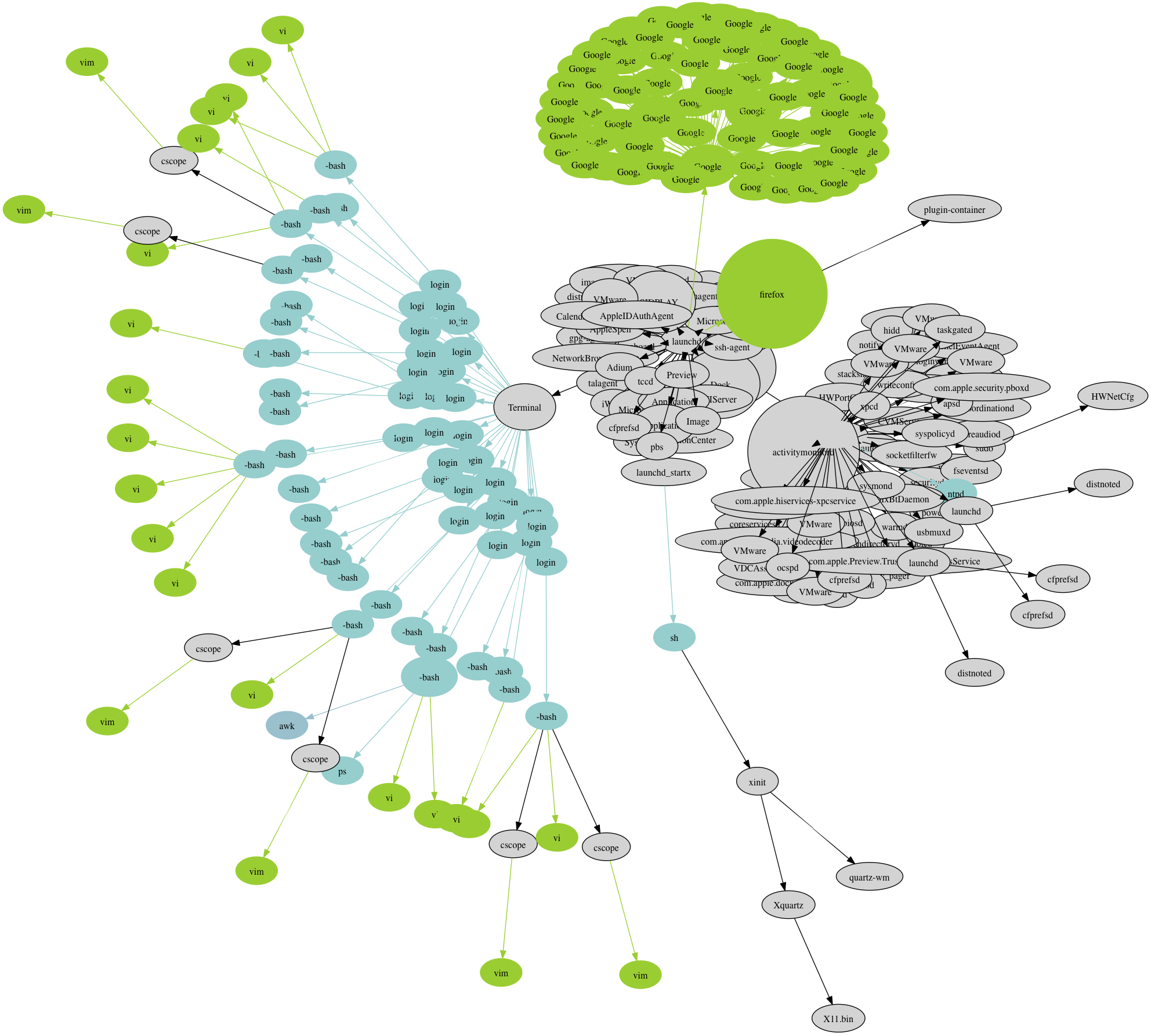
If you look closely, you can find the bash shell that's running the ps(1) command, like a reflection of the photographer.
Adjust -Nfontsize and -Elen (edge length) as desired. You can also customize the colors.awk file, which maps process names to colors. It uses gray if a mapping isn't present. There is also setting in ps2gv-p.sh, cpulimit, which adjusts the scaling of the node sizes.
To use this on the cloud, collect the ps(1) output from multiple servers and concatenate before processing with ps2gv-p.sh.
Conclusion
Process colony graphs is a simple visualization of process parent/child relationships, which is a useful way to study environments at scale, up to entire datacenters. These were an experimental visualization created using ps(1) and graphviz, and have proven useful, finding issues that other observability tools have overlooked.
For more colony graphs, see the main page.