Colony Graphs: Process Snapshots
In Visualizing the Cloud I showed processes and their parent-child hierarchy, across a cloud environment, exploring patterns at different scales. Here I'll take this a little further and look at processes over time. These are experimental visualizations shared to explore ideas.
It's Alive!
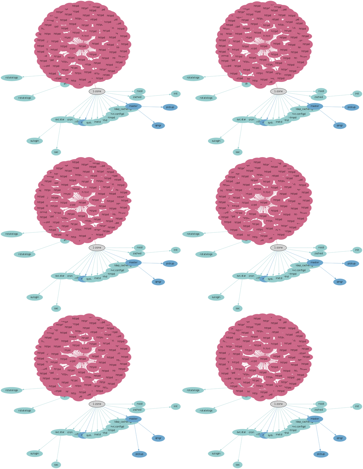
Many who have seen this have described it as "creepy" -- looking like a beating heart or some microscopic life form.
It's showing a busy Apache web server, with frames (process snapshots) taken at 60 second intervals. The above animation spans 20 minutes, shown as a 2 second loop, creating an effect similar to time lapse photography. The size of the processes varies based on recent CPU usage, with larger meaning busier, and the color shows the type of process based on its name (process names that I didn't assign a type for default to gray with a black border). The processes grow and shrink as their recent CPU usage varies over time, which looks like it happens across all of the httpds suggesting Apache is balancing work evenly.
Application Server
While the previous animation was somewhat interesting, many servers look more like this:

It's common in the cloud environment that a single OS instance runs a single application, in this case a web server. Not much changes over time, as seen by taking snapshots each minute.
Multi Application Server
This is an OS instance running multiple applications (click for higher res):
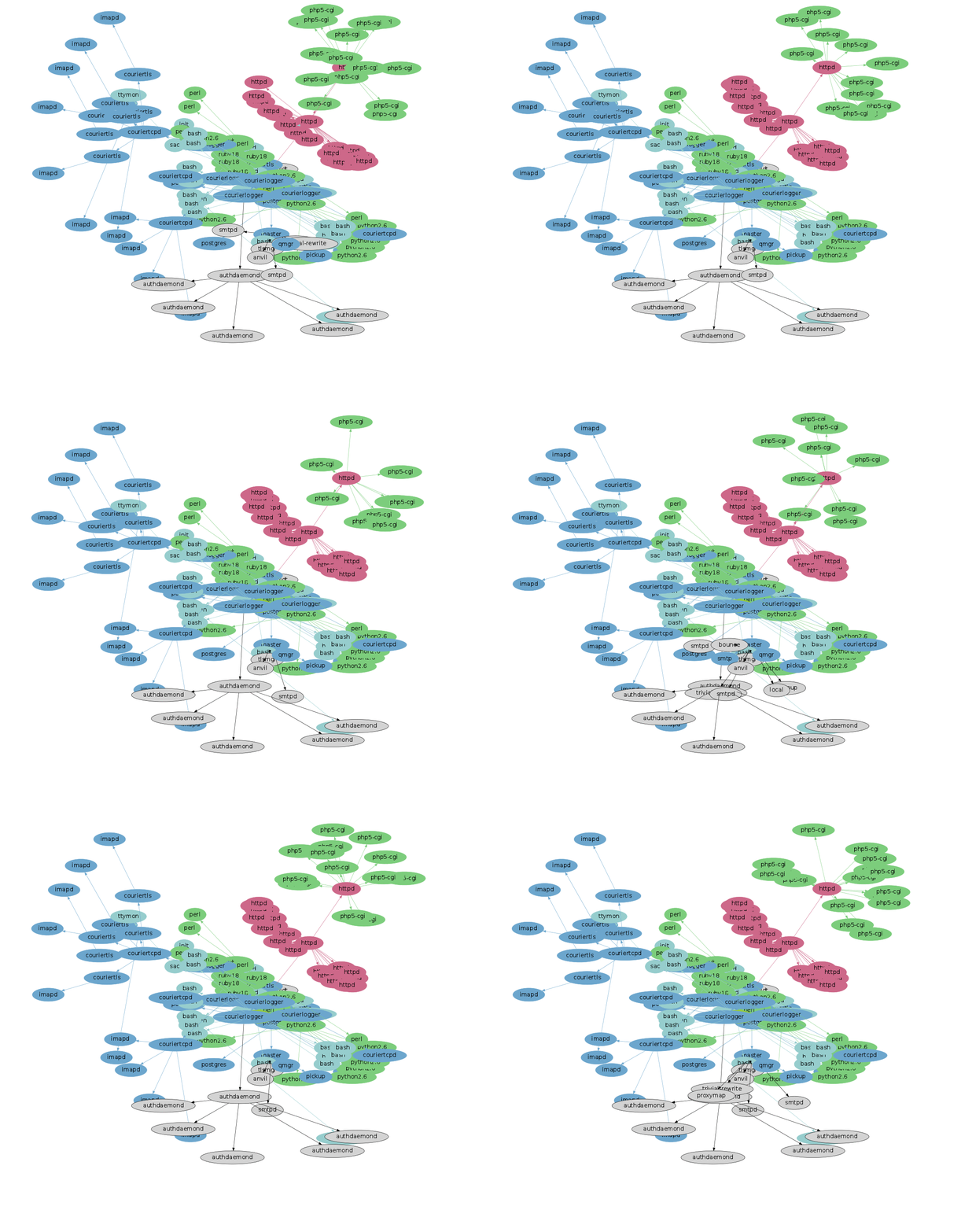
These include a web server and a mail server. This animation is much busier, as processes are created to dispatch work and then terminate. These include php5-cgi processes, which shows the more expensive method of serving PHP, instead of using mod_php as an Apache module. (The earlier beating heart may have been a PHP site using mod_php - we can't tell from the process name alone.)
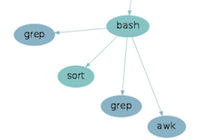
A problem with animations is that identifying details relies on memory and patience. One frame in particular shows short-lived processes appear in the lower left of the animation, launched by an imapd. These are shown on the right: a bash process launches two greps, a sort and an awk – typical shell scripting commands (they may have been launched together via pipes). It can be important to be aware of short-lived processes like these when investigating server performance or troubleshooting odd behavior.
Time as Transparency
By merging together the frame details, we can see all the processes at once:
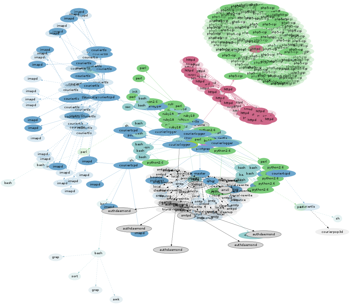
The first frame is shown as before, with subsequent frame processes added with transparent colors and dashed lines. This way, the original layout is included in opaque colors, and additional information from the time domain is represented as transparent elements. The length of each arrow has been stretched a little further to better separate process names (click for high res).
This image includes 45 process snapshots at one minute intervals (the animation only included 20 of those snapshots). The density and patterns created are related to the activity and how many snapshots are included. Consider how this might look if it included a web server restart. In that case, two clouds of httpd processes would be visible, the second launched from a transparent master.
The use of transparency reveals more detail in areas of dense processes, as process names can be seen through overlapped processes. These overlaps also increase the color saturation, which provides another visual clue to the density.
Long Exposure
Another approach is to show opaque colors for the processes that were present in all frames, and transparent colors for processes that were in a partial set. The degree of transparency is weighted based on the number of frames that include that process - fewer frames meaning more transparent, and less time that the process was running during the sampling period.
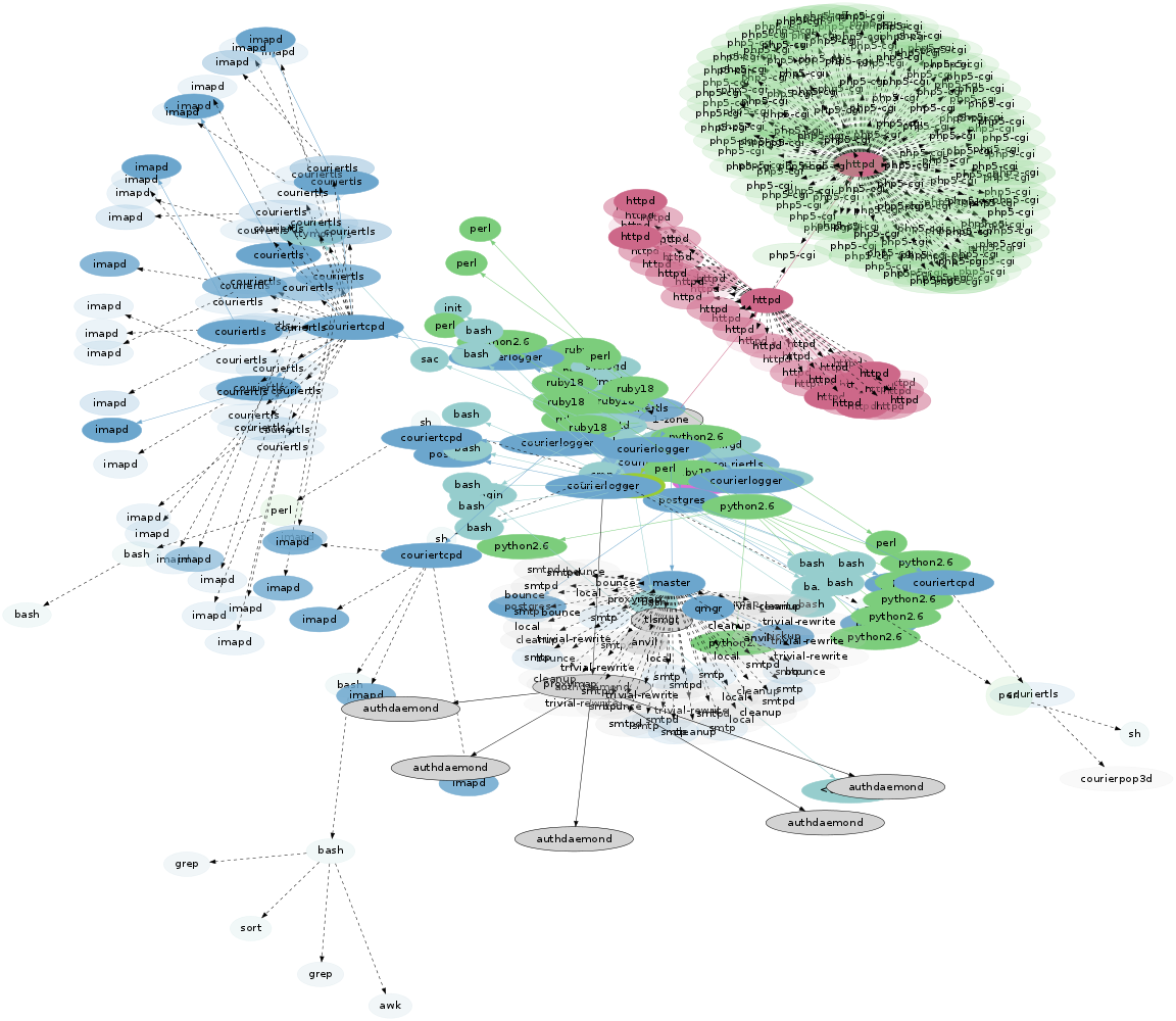
This creates an effect similar to long exposure photography.
Instead of using the first frame to size processes, the size here reflects the average CPU usage across all samples.
Ordinary Example
Not all merged process visualizations are as pretty as the ones above; here is the single application server from earlier, adding time as transparent elements:
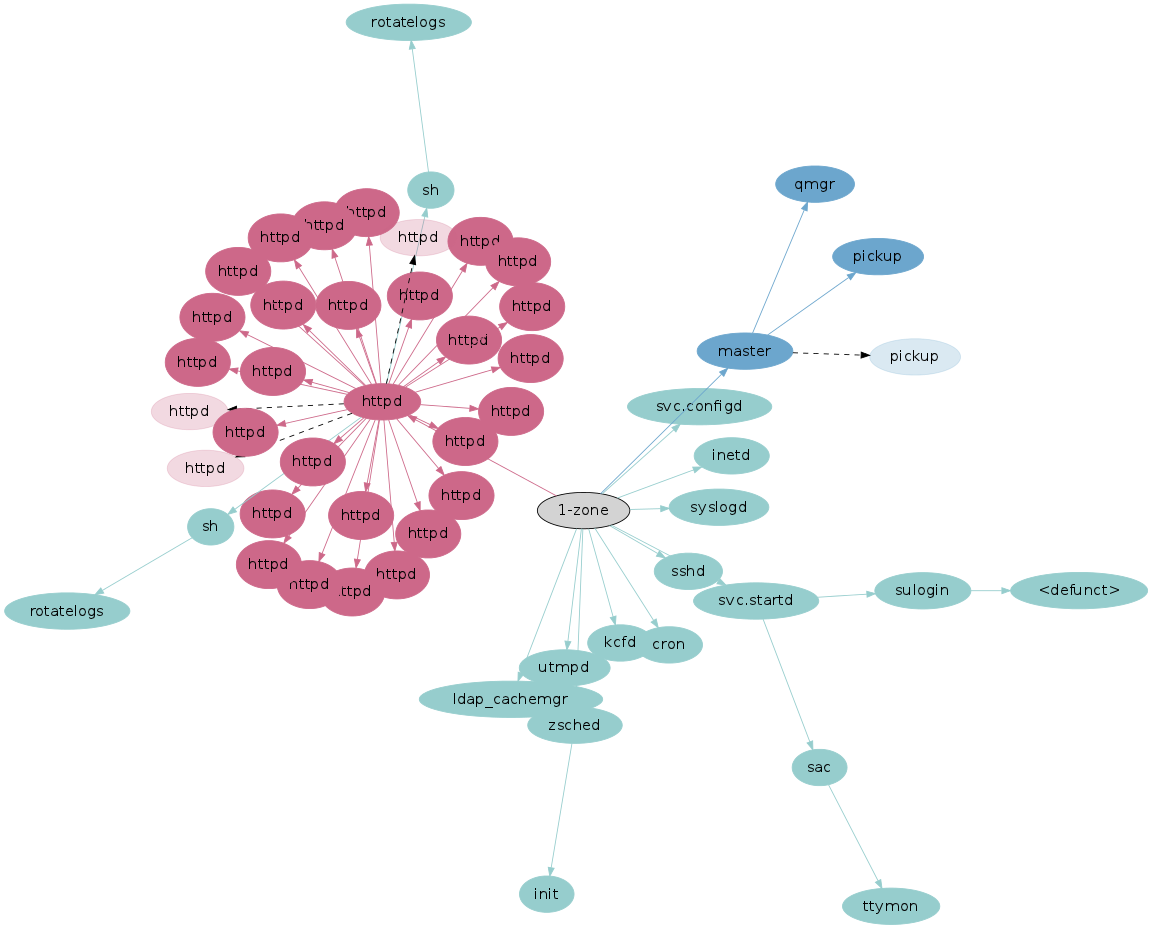
And as a long exposure:

The difference between the types can be compared. An advantage of the first (time as transparency) is that a complete process snapshot can be seen in opaque, which can be studied and understood before considering the transparent time domain. For example, it shows that the "master" process was running one "pickup" process only, for the first snapshot. Comprehending the process tree in the long exposure version is less clear. It provides a better sense of how long the shorter-lived processes were running, based on their color saturation, but it's less clear what a single valid snapshot would look like (eg, "master" may have run two "pickup" processes half the time, and none the other half).
Server
As an example of scaling this visualization, here is an entire physical server that is running many small OS virtualized instances (mostly web servers):
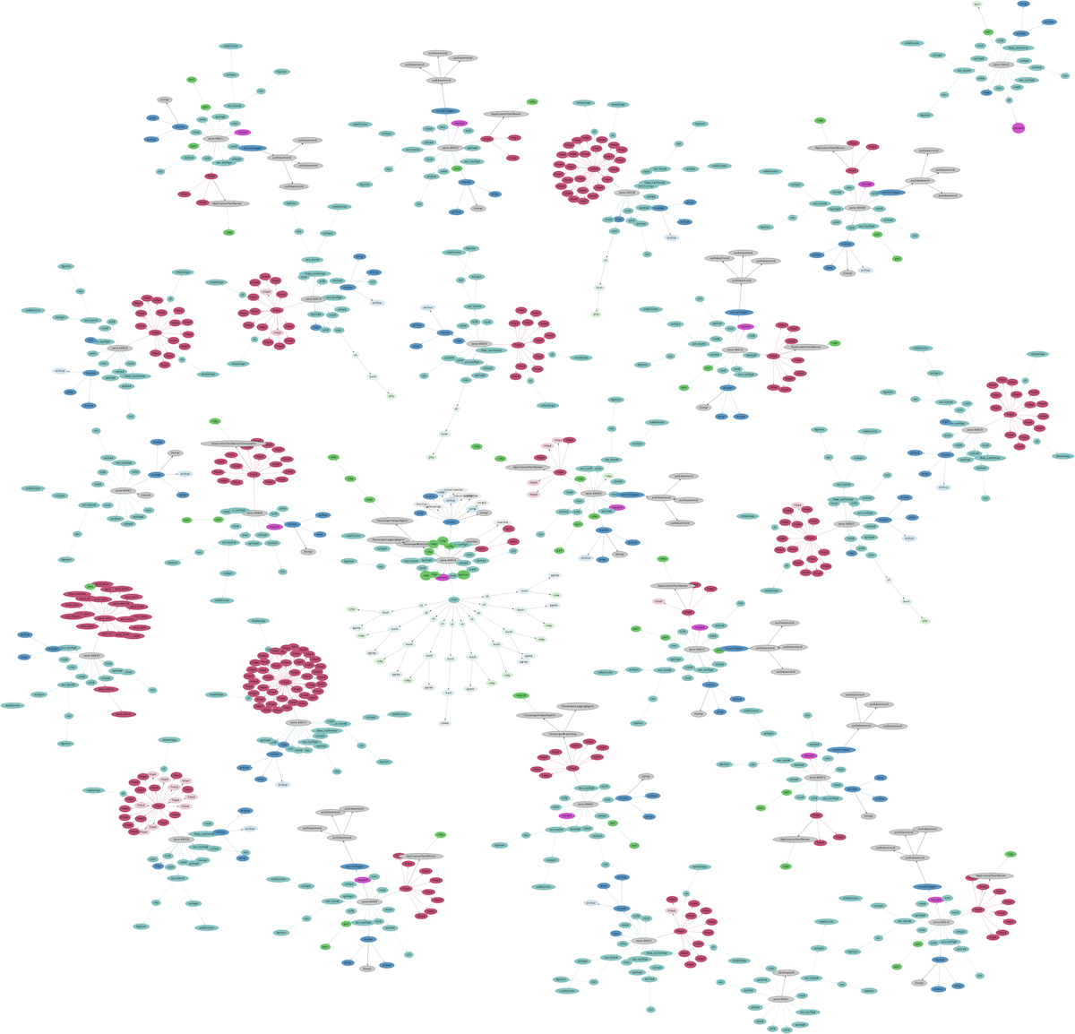
This is the time-as-transparency version. Here the snapshots have picked up some shorter-lived processes launched from cron.
Snapshot Limitations
Taking process snapshots every 60 seconds - or even every second - may miss many short-lived processes altogether. Processes can execute and complete in less than ten milliseconds, as is especially the case with shell scripting built upon small process-based commands.
Process snapshots only provide a coarse idea of what has been running.
Any tool that takes a process snapshot suffers this problem. Taking snapshots more frequently increases the collection overhead from reading /proc often. This may be more noticeable in an OS virtualized cloud environment, where /proc is larger than usual as it contains processes from multiple tenants.
Comments
I showed three different experimental ways to visualize process snapshots: as a time lapse animation, as an image by adding time as transparent elements, and as a long exposure image. The data being visualized is basic: process snapshots ("ps -eo zone,ppid,pid,pcpu,comm").
The images above were generated using graphviz, with some awk to convert the ps output into neato graphs. The most tricky part was building the animations: graphviz initially did layout for each frame completely differently, often rotating the entire scene by 90 degrees or more. The workaround was to render all frame elements in every frame, and applying an "invis" style to the non-present elements for each frame. (It's as fun as it sounds.)
For cloud environments this type of visibility has been made easy for thanks to using OS virtualization to run cloud instances. This allows ps from the global zone on each physical server to inspect details from all OS instances directly, without needing to connect to agents for that information. To visualize the entire cloud, I need to connect to the physical servers only.
For more colony graphs, see the main page.